
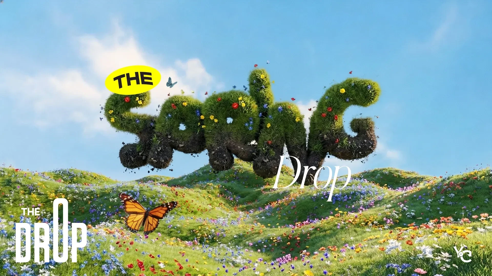
Role — Creative Direction, Brand Design, Merchandise Design & Campaign Design
The Drop is a recurring SPWR merchandise program that evolves through seasonal collections. I created the program and own it from the first brainstorm through final execution: concept, seasonal direction, merchandise and apparel design, product graphics, campaign visuals and 3D imagery.
Company — SPWR
Each season introduces a new visual direction, product mix and campaign style while remaining part of the same Drop program. Spring, Summer and Fall each have their own personality, with Winter currently in development.
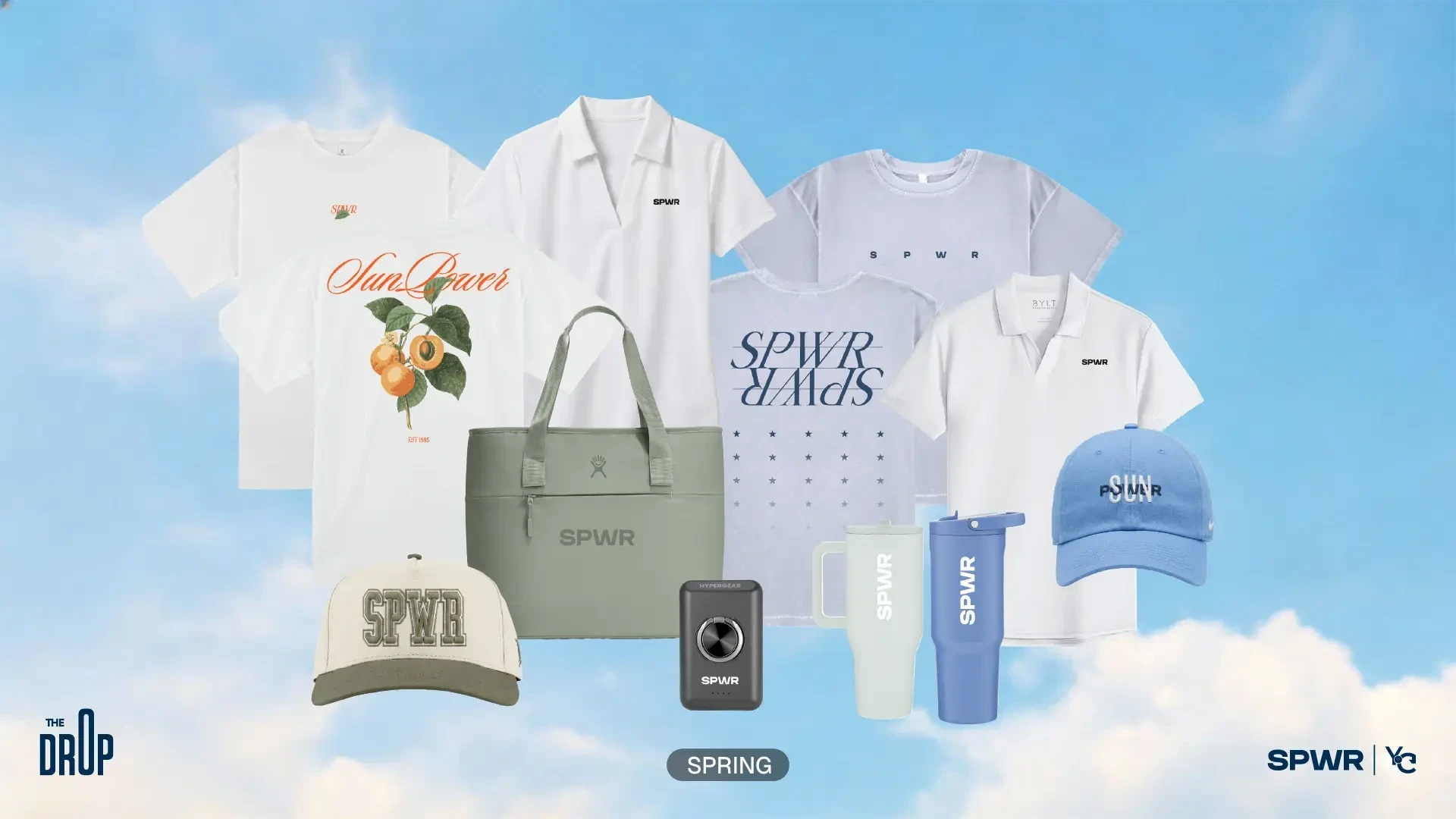
I designed the apparel graphics and branded product applications alongside the seasonal direction. The Spring tees pair botanical illustration and orange script with mirrored navy typography; the accessories carry SPWR into embroidery and tonal graphics.
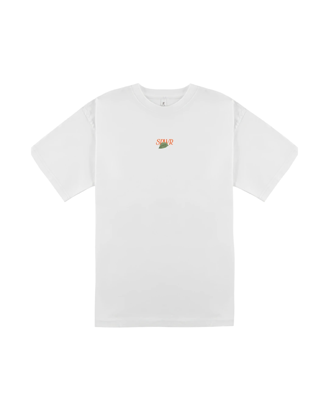

Botanical tee — front / back


Typography tee — front / back


Headwear, insulated tote and drinkware — graphic applications across the collection.
I carry the collection’s visual direction through campaign imagery, 3D presentation and promotional assets. These Spring films extend the product graphics into scenes built around the apparel and headwear.

Spring Sector — hat campaign

1985 Grove & Parallax — apparel campaign
View the full Spring campaign on SPWR Social Media.
From Spring’s botanicals and mirrored type, Summer moves into pinstripes, racing graphics and “Stay Loud” apparel.

I developed Summer’s merchandise graphics around a different mix of products. The custom jersey combines pinstripes and wide SPWR lettering with a motorcycle and racing flags on the back. The tee, headwear and sport pieces use their own graphic treatments within the collection.


Custom jersey — front / back.


Stay Loud tee — front / back.
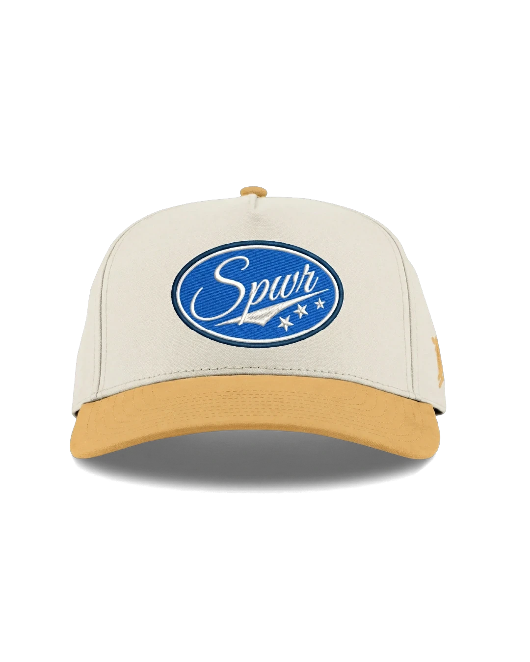

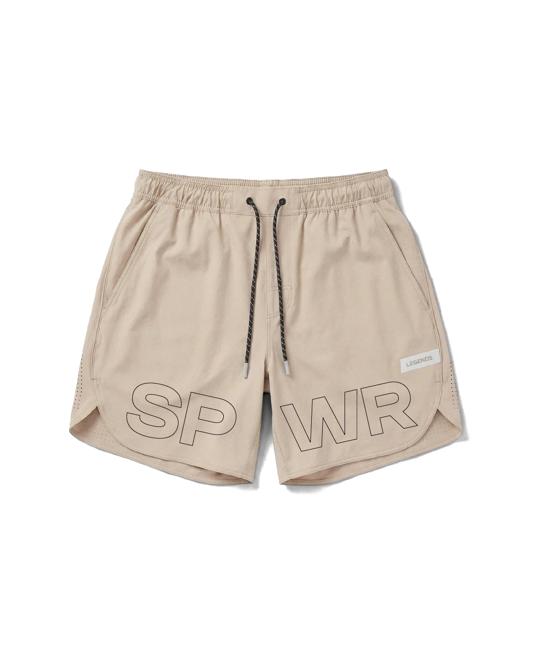

Headwear and sport pieces — patches, spaced lettering and outlined type.

Fall brings a quieter palette and a heritage direction: SunPower script, varsity lettering and an 85 crest across heavier apparel and corduroy headwear.

I designed a family of graphics that could shift in scale and placement across each piece. The oversized tee gives the crest and script room to lead; the long sleeve uses a smaller chest mark. The jacket carries Heritage lettering, while the cap translates SPWR into an embroidered monogram.

Oversized tee — back graphic.

Long sleeve — crest and script.

Jacket — Heritage lettering.

Corduroy cap — embroidered monogram.
The seasonal direction continues through the presentation and social carousel: wood-textured lettering, autumn hills and product compositions that keep the garment graphics central.

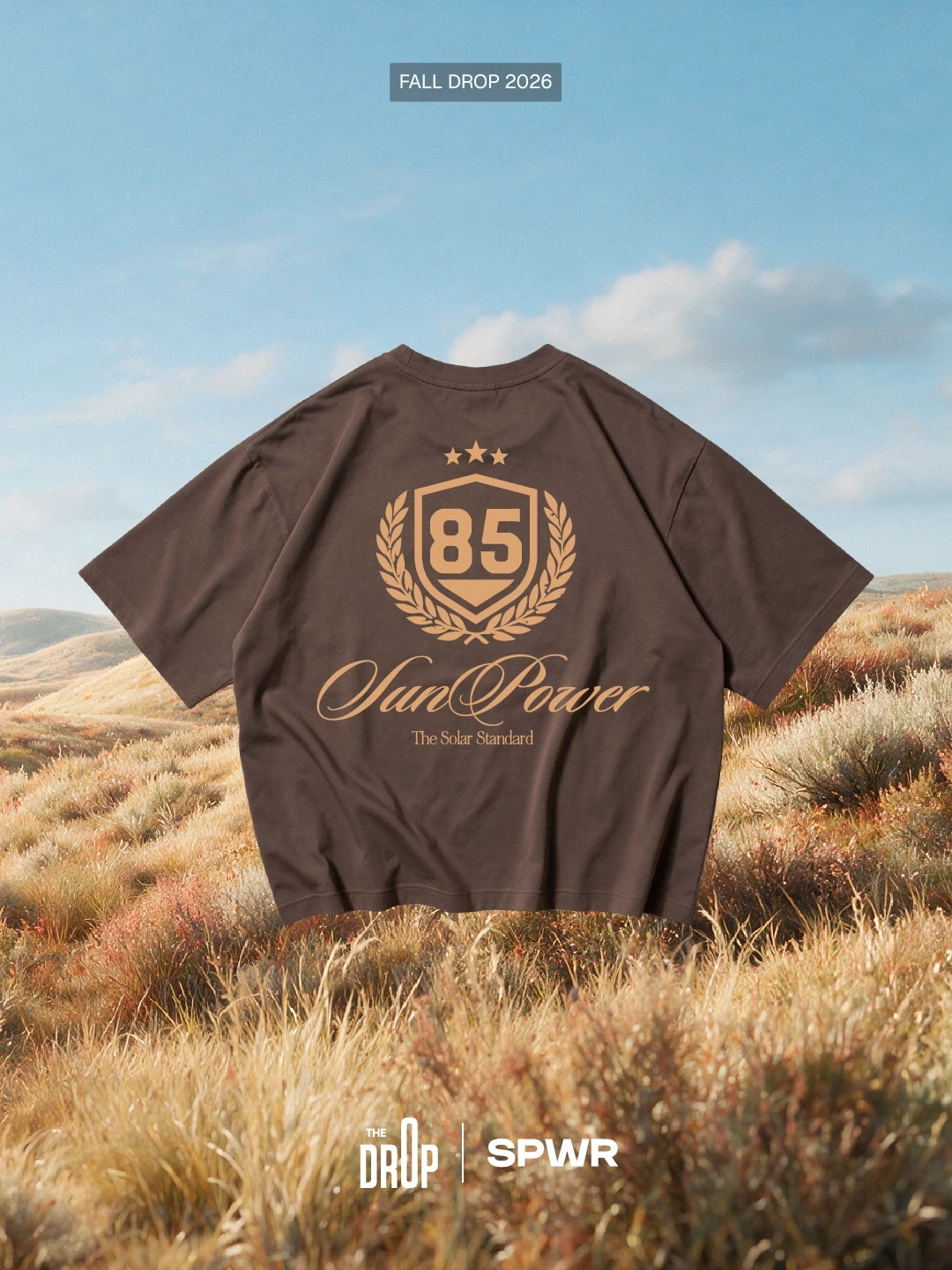
Fall carousel — oversized tee.

Fall carousel — long sleeve polo.
Coming Soon — currently in development.

Create with me